Thanks to Richard Banks for pointing me towards this piece published on Fast Company’s site by Don Norman and Bruce Tognazzini (Tog):
The article is a hard hitting critique of Apple’s current design philosophy. More than this, though, the two long time interaction design gurus set out a clear project for design, one that they see Apple having been instrumental in but now deviating from. Their general argument is, on the face of it, pretty convincing. Yet digging a little deeper it’s one that I have problems with. This post is really an effort to sort things out in my own mind.
I think, outwardly, at least, Norman and Tog have a point about Apple doing a disservice to design. Certainly, in their marketing and stores, they are putting a lot of emphasis on visual aesthetic and physical form. As Norman and Tog say, this conveys a message that the business of design (and how it is being widely promoted by Apple) is all about making things pretty. I am fairly confident though that Apple’s designers would make a strong case for putting meticulous effort into interaction cues, and visual (and tactile) feedback—that is, in thinking carefully about the ensemble of product/interaction design. I’ve read interviews with Apple’s designers saying just this and heard Ive talking about the painstaking efforts to convey interactional qualities through animation, touch, tactility, etc. Whether they’ve made good choices or not is, I’d say, another matter.
Again, I also recognise that Norman and Tog have some very clear and convincing arguments for the kind of interaction design they proselytise. I worry though that they are part of the old guard that sees some of the original ‘solutions’ to the problems they themselves created/defined as the best ones (for example, what they see to be ).
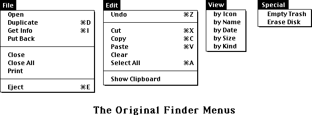
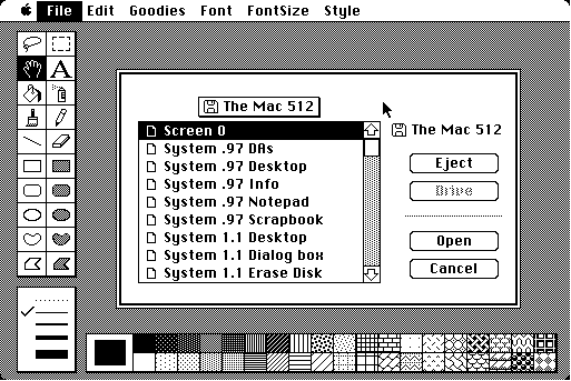
If we were to take this reference—indeed reverence—to Apple’s past design at face value, we would be led to imagine that none of us had problems with using earlier versions of Mac OS. Well, of course we did. I never really got on with Apple’s original bitmap Chicago font, the open/save dialogues were notoriously confusing, and we’re still left with the legacy of a very awkward solution for ejecting media.
More importantly, there is a sense of the authors misjudging the changing ways we have come to think about computing and use computers. In fact, I think many people don’t think they’re using computers anymore—at least in how we understood them in the 80s/90s as productivity machines. Our phones and tablets are much more entertainment devices (devices of consumption), not so far from a gaming experience in which many will know things like discoverability, feedback, mapping, and the ability to undo are just not cast in the same mould. Of course, the kinds of design criteria Norman and Tog talk about are important and I, for one, sorely miss them when I try to use Word, Excel, etc. on a iPad. But in the world of iOS, where the forms of use are so very different, I think the issues manifest themselves differently and demand a different kind of attention (one that Norman and Tog choose not to see or perhaps not to understand).
What particularly interests me about this is that I think we need to recognise that what good usability is and, to some extent, what good design is are things we in a sense ‘manufacture’ through the technologies we produce and design. Tog and Norman understand good design guidelines as static, something somehow unchanging, irrespective of everything else that is changing. By talking about “basic psychological principles” they indicate an obduracy to what good design might be, but fail to recognise that this is deeply bound to the continuously changing material practices we are enabling through ‘computing’. They write: “principles reflect the needs, desires, and abilities of human beings, not the machines they use.”
The trouble is our needs, desires and abilities are inexorably entangled with matter, matter like machines. The qualities of being human can’t in some way exist outside of these entanglements. Of course, there is much to be gained by looking back to designers like Dieter Rams, but I think what we’re doing when we do this historicising is reworking old concepts into contemporary moments, undertaking a translation work to make these meaningful for the assemblies of things and people we are dealing with today. So, to me, the guidelines Norman and Tog speak of make most sense for the machines that they played a role in engineering and building. A principle of consistency has a very particular meaning for the early Mac OS that, I feel, doesn’t translate in any straightforward way to contemporary operating systems and ecologies of apps, etc. What Tog and Norman miss, I think, is that we are always giving shape to new and different possibilities of good design through the things we create. As computing has diverged from the Macintosh (and PC), we have created logics and rationales that present fundamentally different kinds of interaction where it doesn’t always make sense to rigidly apply past principles.
Even though Tog and Norman plead for us not to, yes, let’s take the popularity of the iPad amongst—for lack of a better category description—retirees (or ‘grandparents’ if you like). I know I’m not alone in being struck by how people from my parents’ generation can get so intimately attached to their iPads. I think we have to ask what’s going on here and not brush aside what is visibly a genuine intimacy by simply criticising some specific user interface features based on the design of “traditional computers”. And this is meant as more than the hackneyed “could my mother use it” kind of point. Really, what’s going on here? Of course, there are probably plenty of reasons for the iPad’s appeal (and I don’t mean to overlook a lot of the really difficult and frustrating aspects of using them), but I think we’re witnessing a different set of expectations around computing and the relationships we form with machines. This seems to be something Norman and Tog don’t want to acknowledge (despite Norman’s efforts to understand ).
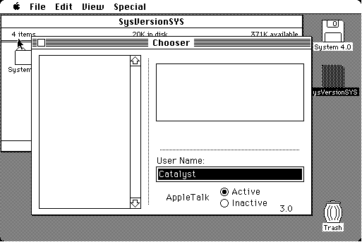
As I see it, the iOS aims to reveal (and make discoverable) a different set of qualities that appeal in different sorts of ways and that fit within a logic of portable and touch enabled devices in the way the Mac OS doesn’t (and shouldn’t). In the original design of the Mac, choices also needed to made about what was immediately discoverable and what would be buried under the menu architecture and in obscure dialogues (remember the Chooser?), and this presented a particular kind of logic-of-use. With the iOS, I think (intentionally or not) a different kind of experience is surfaced by the decisions to reveal and hide interactional capabilities, and the logic-of-use here is fundamentally different; I feel like the iPad, etc. is much more about the feel for content (and to some extent, creation). So perhaps it’s this that makes the devices so appealing and that many of us, including my parents, get so attached to.
Finally, I should say that I am a long time Mac user but I feel wedded to Macs (and the Apple ‘ecosystem’), for now at least, because that’s what I’ve bought into and am used to using. I’m really not sure whether Apple’s interaction design is especially better than anyone else’s and I think there are lots of things that confuse and frustrate me about their various operating systems. This post isn’t one defending Apple’s design, but more a response to what I see as Don Norman’s and Bruce Tognazzini’s views on design.